Kudima, Brand Identity
Services provided:
Brand DNA Strategy
Logotype Design
Art Direction
Tone of Voice
Slogan
Landing Page
Brand Guidelines


Challenge
Define a brand DNA strategy and create a brand identity for a tech company wholly focused on creating a platform for human transformation. To serve humanity by facilitating human capability and growth for a better tomorrow.
Idea
Kudima creates online tech platforms ready and open for humans to add into, multiply with and together flourish human growth. It provides humans a marketplace for online learning and teaching. An open space, like an open mind, facilitates the conception of limitless possibilities. In essence, Kudima opens up this space, ready for humans to fill.
Result
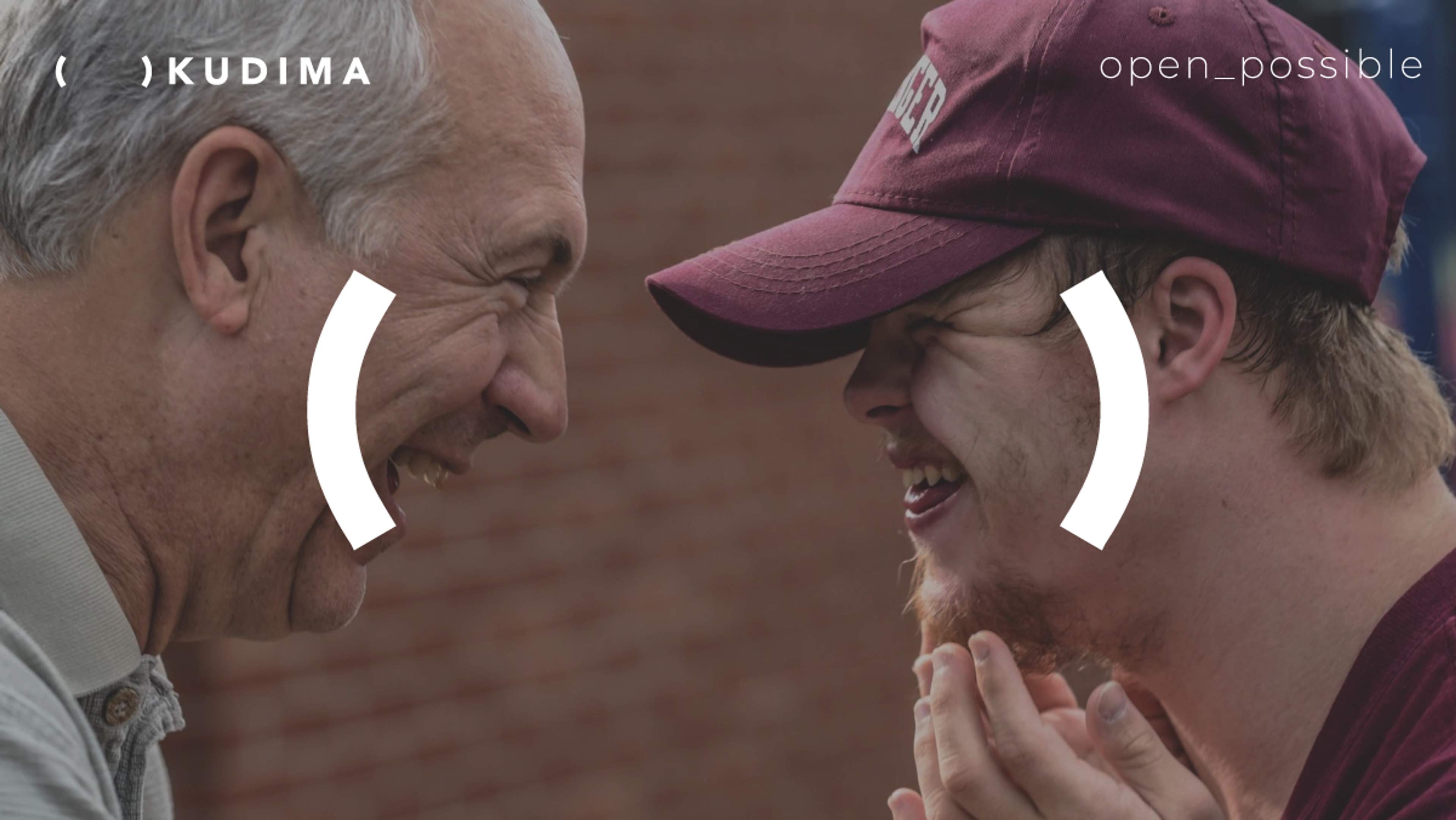
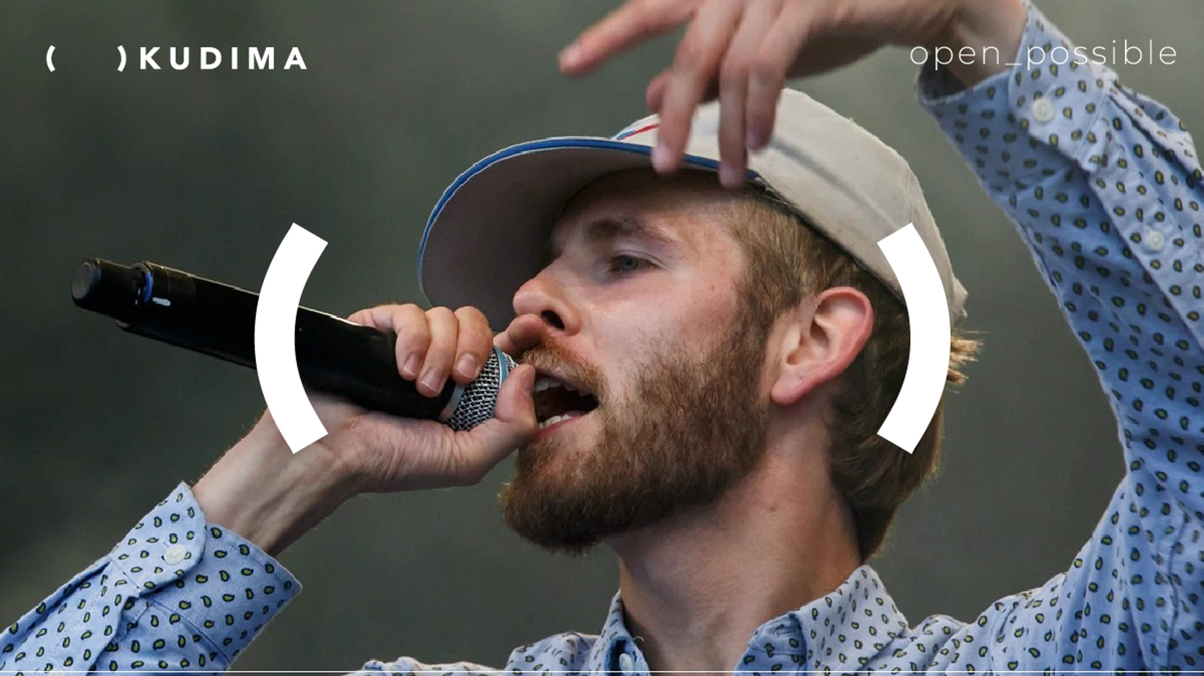
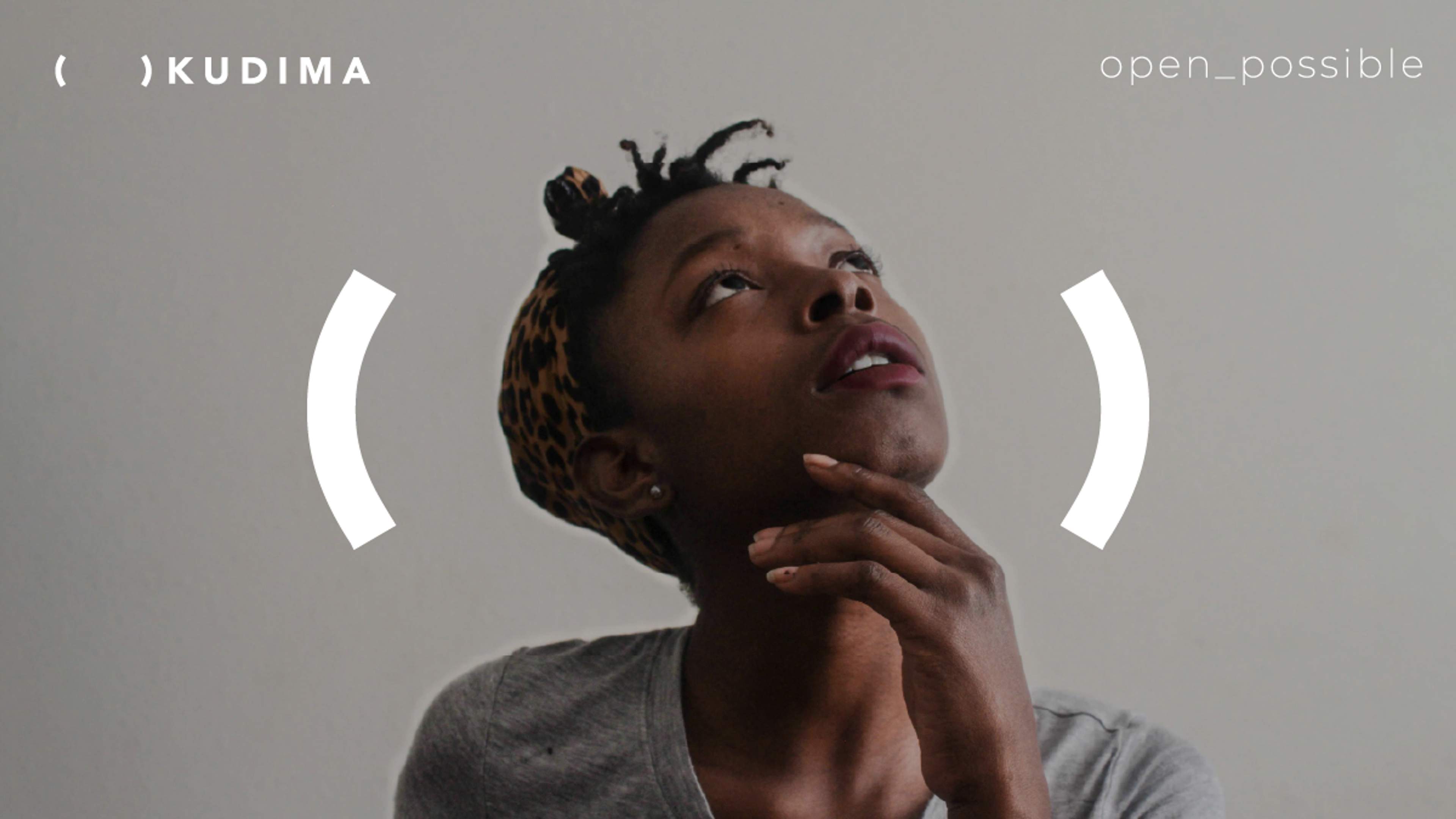
The outcome was a logotype and brand identity based on the natural phenomenon of opposites and the symbiosis of empty and full existing through one another. Visually and semantically it defines an open space which needs to be filled. It requires the human aspect to fill in the void. The colour palette also reflects the absolute polar opposites of black and white, shadow and light. Within this absolute range, diversity can be expressed through myriad shades of grey.
The underscore is a punctuation mark that joins words, indicates combined meanings and linked concepts which connects ideas, people and the world through titles such as: made_for_humans, made_for_life, open_tomorrow. This ultimately led to the brand promise in line with Kudima's DNA: open_possible.