Mindseed, Brand Identity
Services provided:
Brand DNA Strategy
Logotype Design
Art Direction
Tone of Voice
Slogan
Landing Page
Brand Guidelines


Challenge
To create a brand identity for an online tech company that is human growth centric and to recognise its users as a humans, first.
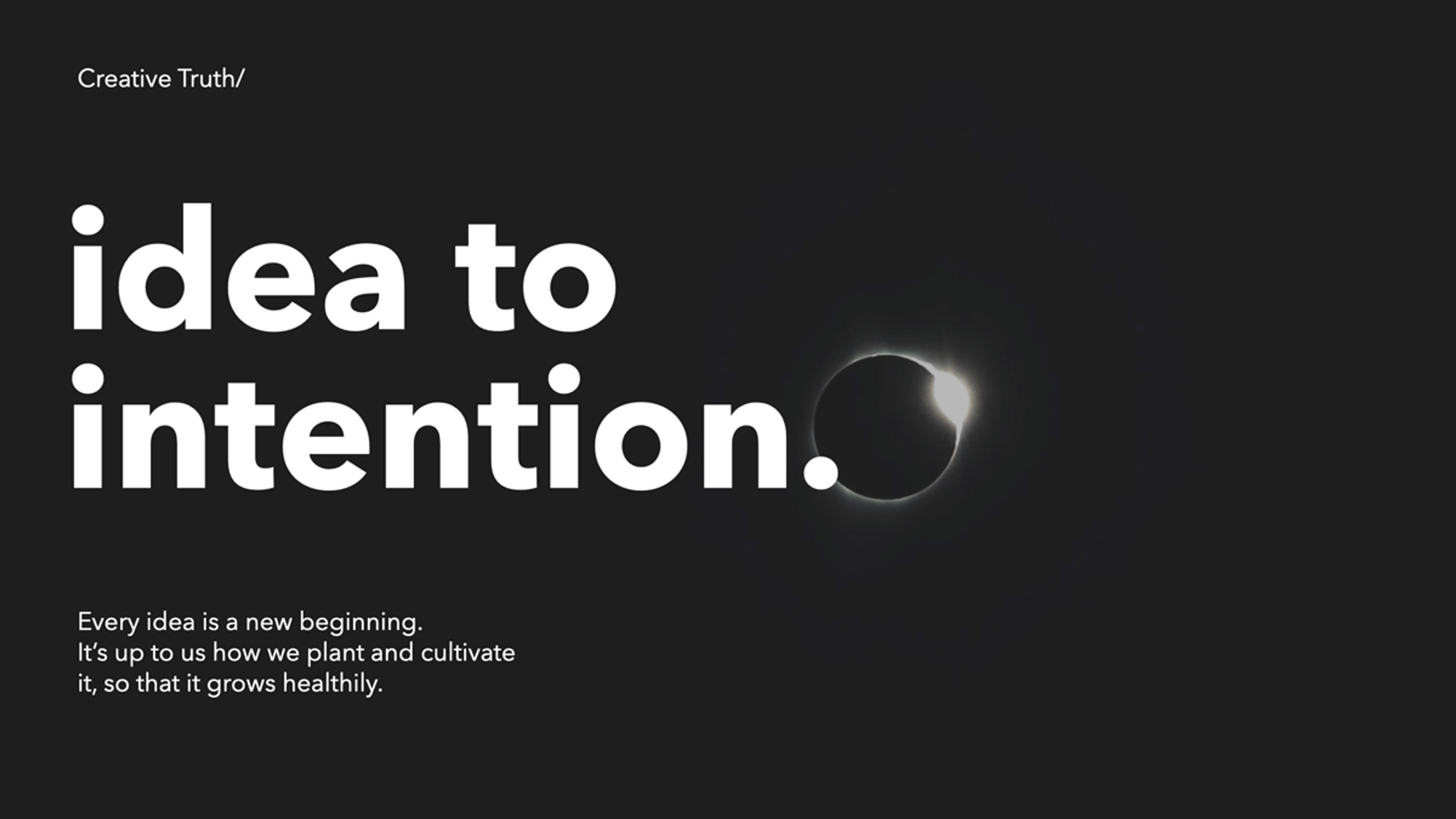
Idea
Every idea is a new beginning. Where we cultivate each idea is vital. So every idea is a seed of potential looking for the right forest to grow the most unwavering trees. Mindseed as a platform is a 'forest' where seeds can expand into their true potential; giant sequoias.
Result
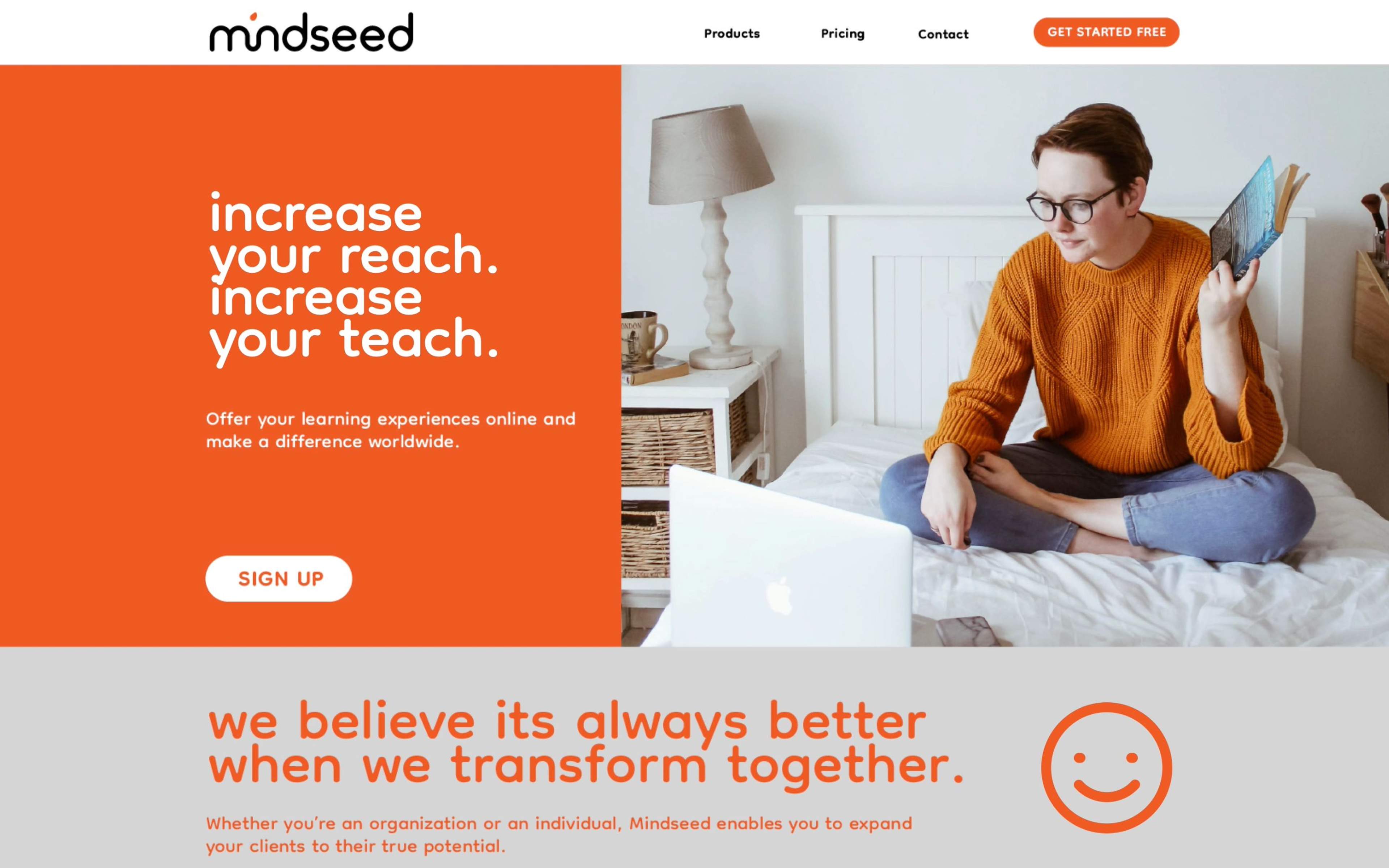
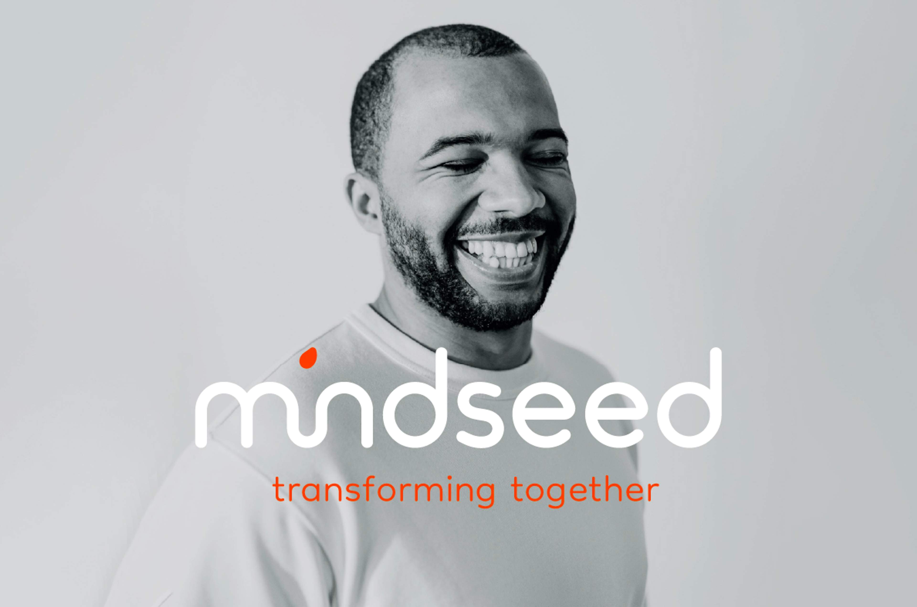
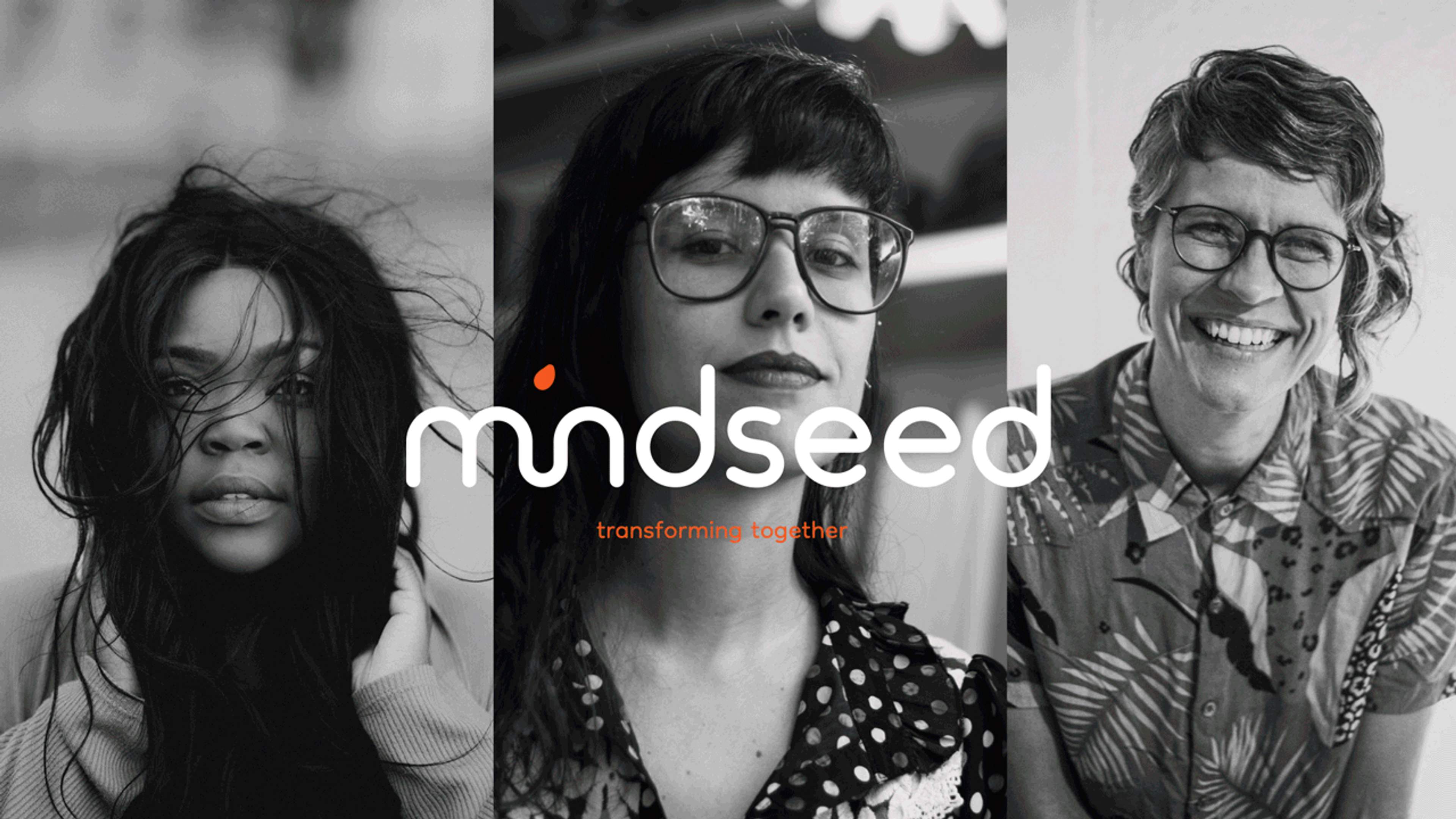
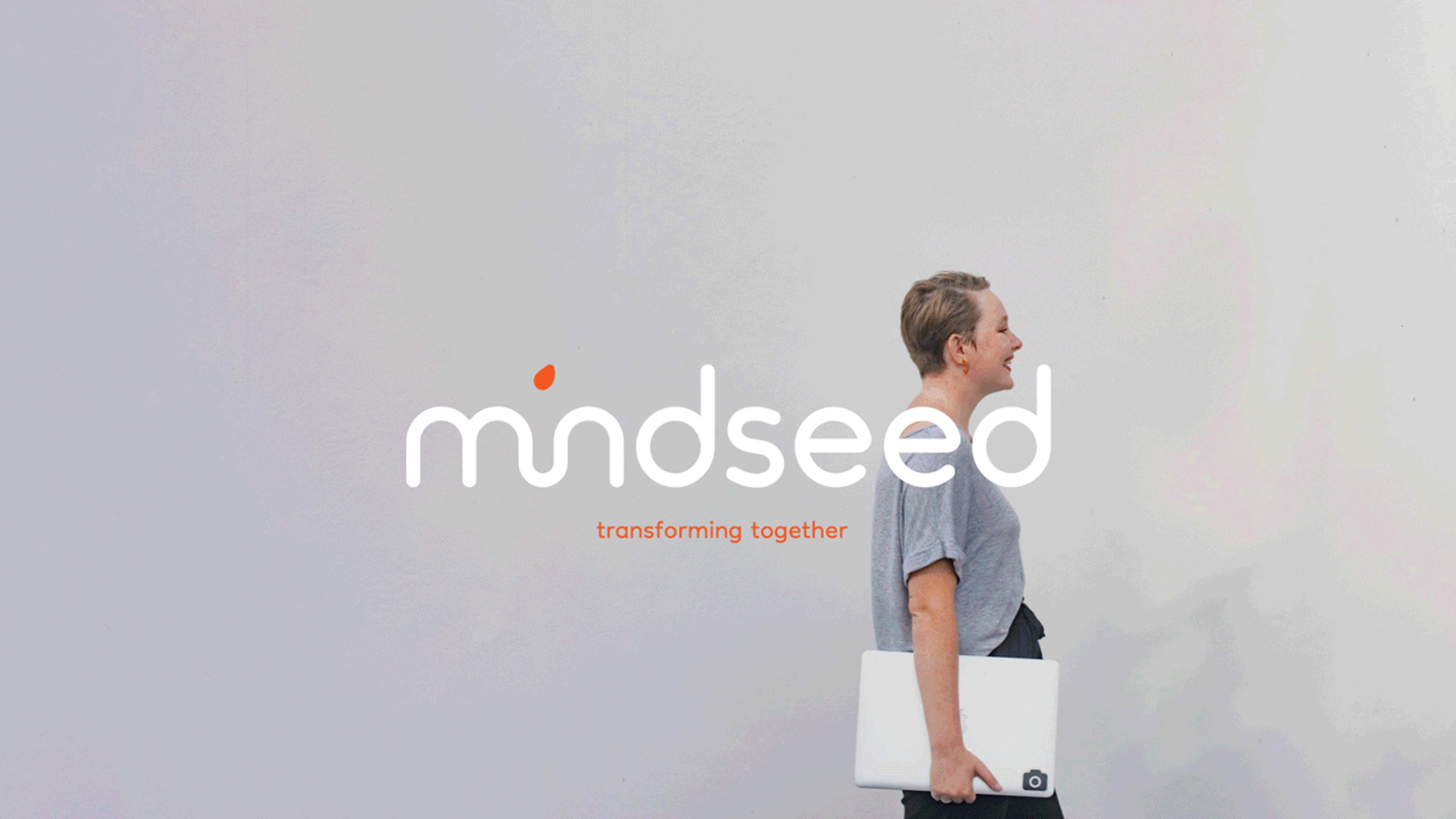
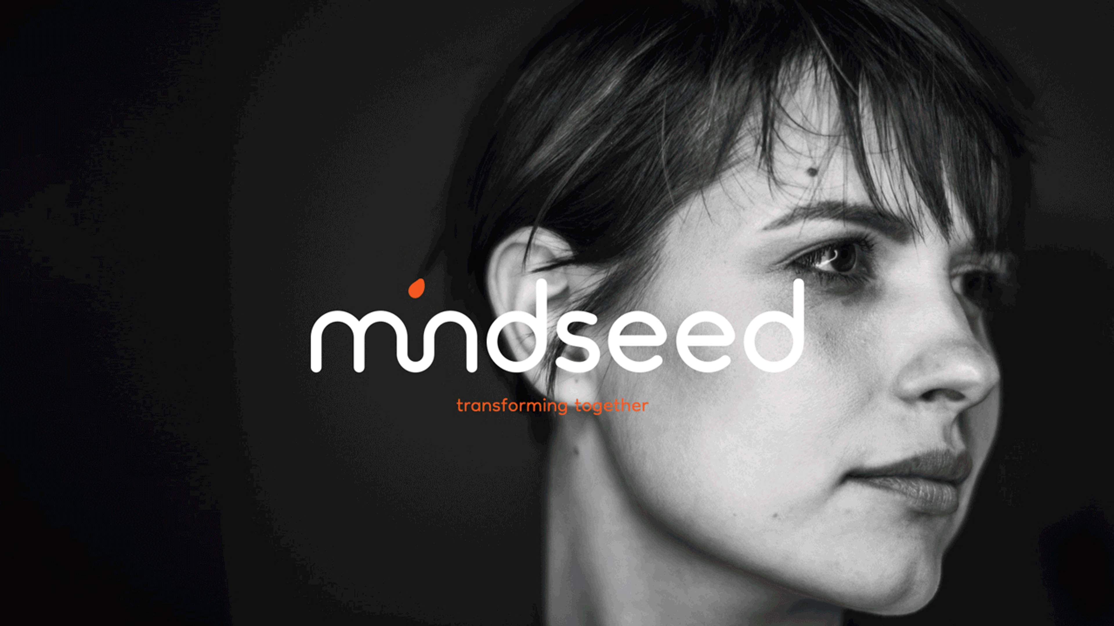
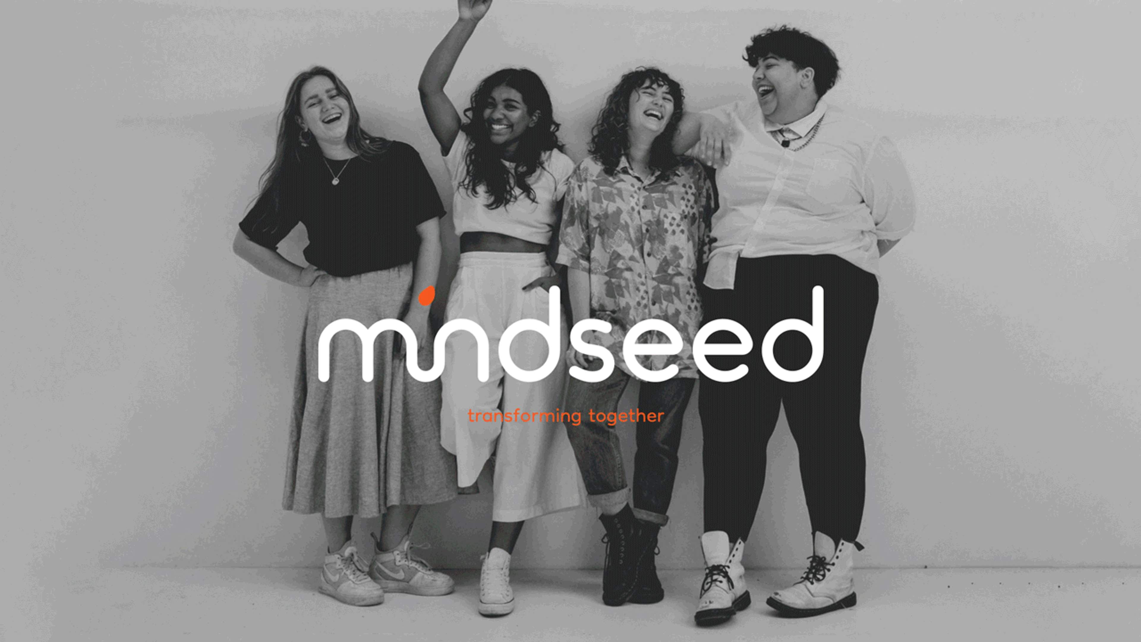
The outcome was a logotype with a custom created font. Lowercase and friendly, Its smooth round linear flow, denotes wavelike oscillations of change. The anagram play of the letter ‘i’, shows the power of human perception to fill in the void, our minds create the letter that isn't there. The dot of the ‘i’ takes the form of a seed which is about to be planted into the embracing earth below. From a mindfulness perspective, removing the 'i' equates to removing the ego which facilitates undivided awareness and non-judgmental attention.
The colour palette embraces a friendly, minimal, yet solid duotone feel. It presents a bold orange which represents the flame of perpetual action and human alchemy, continuously transforming and removing impurities from metal into gold.
The tone-of-voice is human, transparent, curious, fair, accessible and intelligent. The hyphen is used extensively. It’s a punctuation mark that joins words, indicates combined meanings and linked concepts and reflects the brands love for connecting ideas, people and the world.