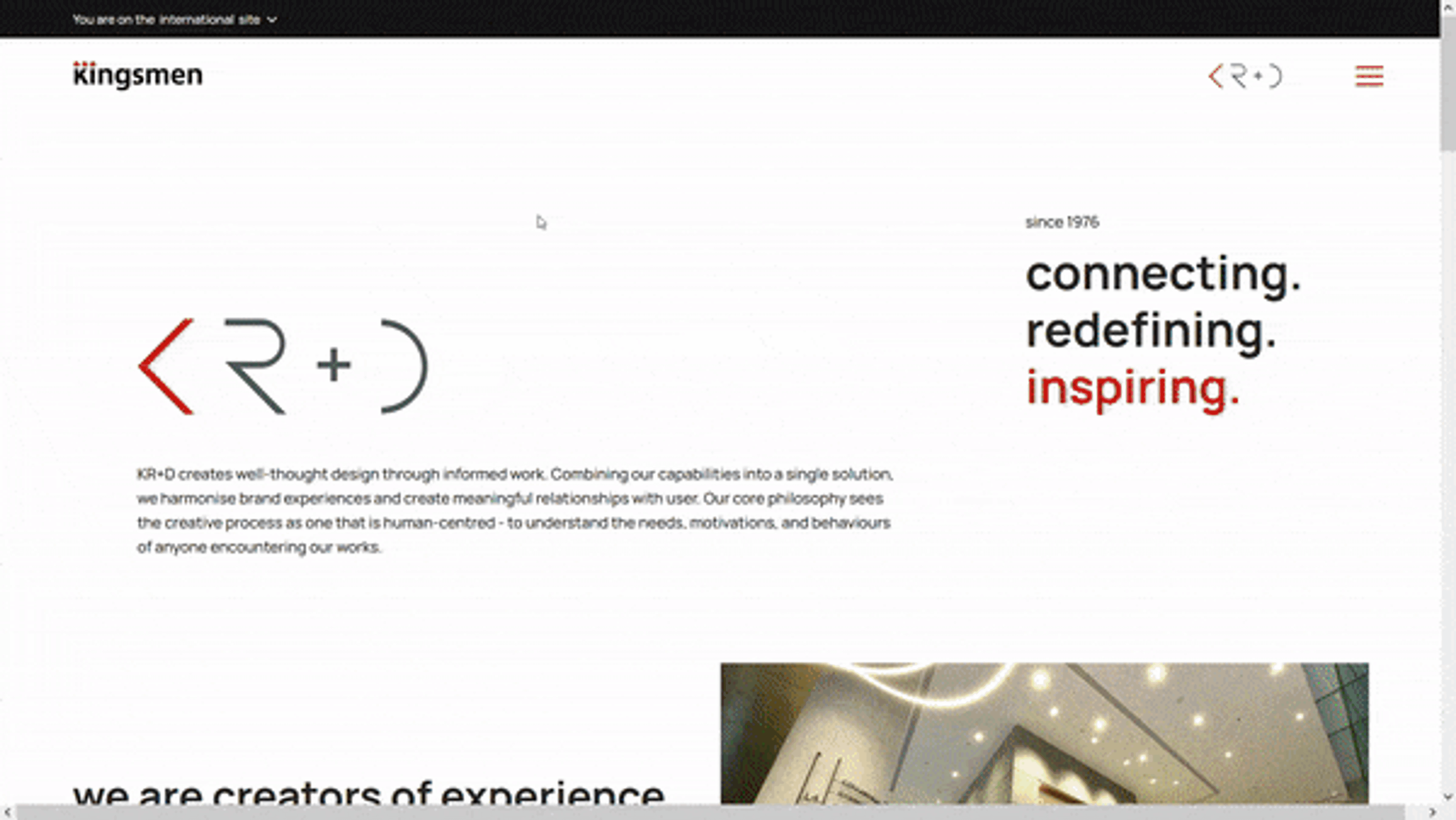
Kingsmen's Online Presence
I...
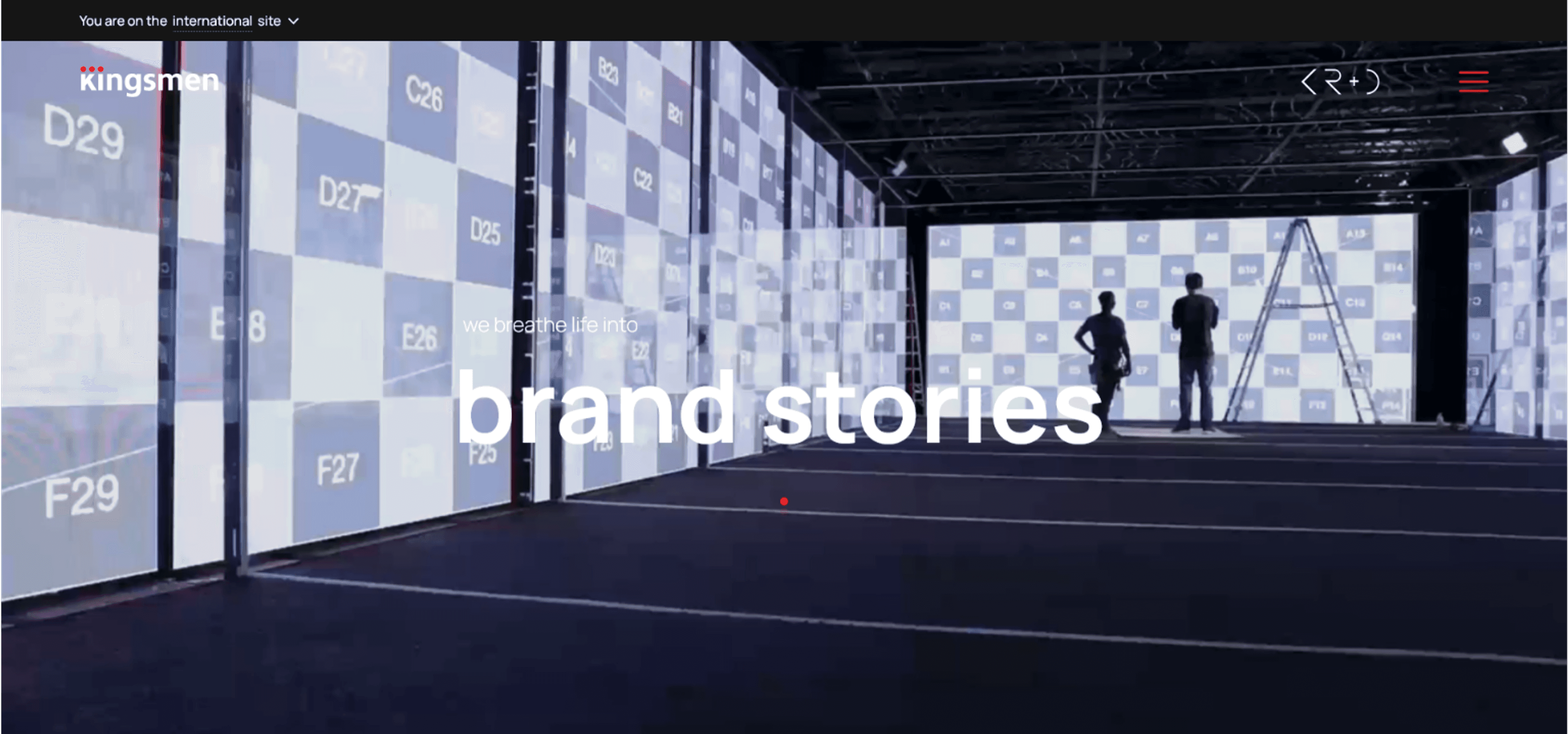
shaped the online transformation of Kingsmen's global site, launching it in time for the group's 45ᵗʰ Anniversary celebration.
For
Kingsmen - a design & production company with 21 offices globally, and locally listed on Singapore's stock exchange market.
The Moving Parts
1. Management & creative team reps
2. Regional comms & marketing teams
3. Developers from webtech agencies
Process
As an internal comms personnel at their HQ, I had to understand the brand's long-standing position, their revitalized purpose, and align with the many moving parts of the amorphic organisation.
Most initially, the site content had to delineate the different teams and their roles, works, services, and function as an archive for all stakeholders.
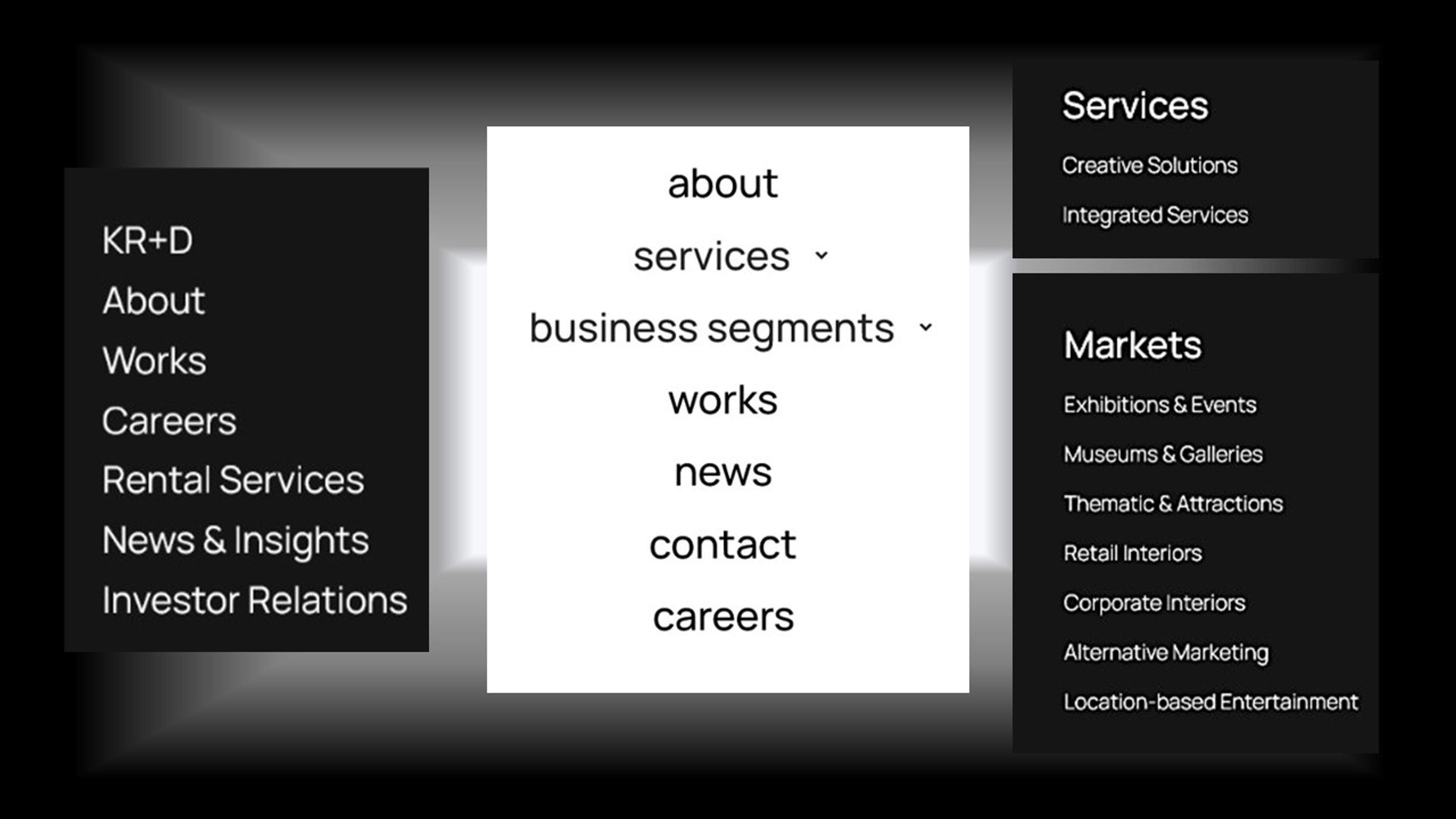
Then, I scale down the essential information through simplifying the browsing experience in categories, words, design, & interface.
Intricate structure
The site had to represent several angles given the capacity of the company and many people it encompasses. The audience includes:
a. Clients looking at relevant works
b. Public with vested interest
c. Regional counterparts
d. Interested applicants
Design was integral in the process to seamlessly connect the many pages.
Working with the webtech team took rounds of testing, tweaks, & approval. This moved the feedback stage up for internal teams to review as well.
Besides considering types of audience who will use the site, the navigation was also refined across all platforms. Testing out desktop view vs mobile experience means noting gestures like switching from arrows to finger swipe gestures, done to optimise user experience.
Making it concrete & credible with content
A portion of time was dedicated to retrieving archival content from the old site and to update current projects on the new site.
I had to reach out to most marketing & regional teams to obtain relevant content of their projects. Information like media, project details, client's testimonials etc. (This content was also useful in building the narrative of the company's 45ᵗʰ Anniversary digital coffeebook - a project parallel to this.)
With many varying expectations across the board - management's overall vision, team's specific voice, and the emerging creative front of the entire organisation, it took some back-and-forth negotiation and understanding.
Channeling a wholesome and inclusive message for all meant that I made the calls on the ideal representation as we reach finalisation stage.
Here, the webtech agency applied similar design template and layout for the participating regional offices who were on board the rebranding movement. With a site made broad enough to represent the global offices, this was released for the organisation's global audience.
Debrief
From selecting the agency, revisiting purposes with management, discussion and negotiation with up to 5 local teams + numerous international counterparts, the project took about two quarters to be fulfilled (August 2020 - March 2021).
As most of the content was geared towards the vision of decision-makers, and aligned with the tactile experience of on-site project teams, I bridged many loopholes from my position as a 'third-party' and that between multi-level stakeholders.
With a total of 16 main content pages built essentially from scratch, and the remaining miscellaneous pages re-designed for the new site, the brand overhaul was successfully completed and celebrated. It launched during an online zoom unveiling for the 45ᵗʰ Anniversary across offices.
Experience it for yourselves!
Reach out to find out more.
For more details on the 45ᵗʰ Anniversary Immersive site project, click below
