Website Rebrand
The project:
Our aim was to rework the StartVirtual homepage, completely repositioning the copy and design.
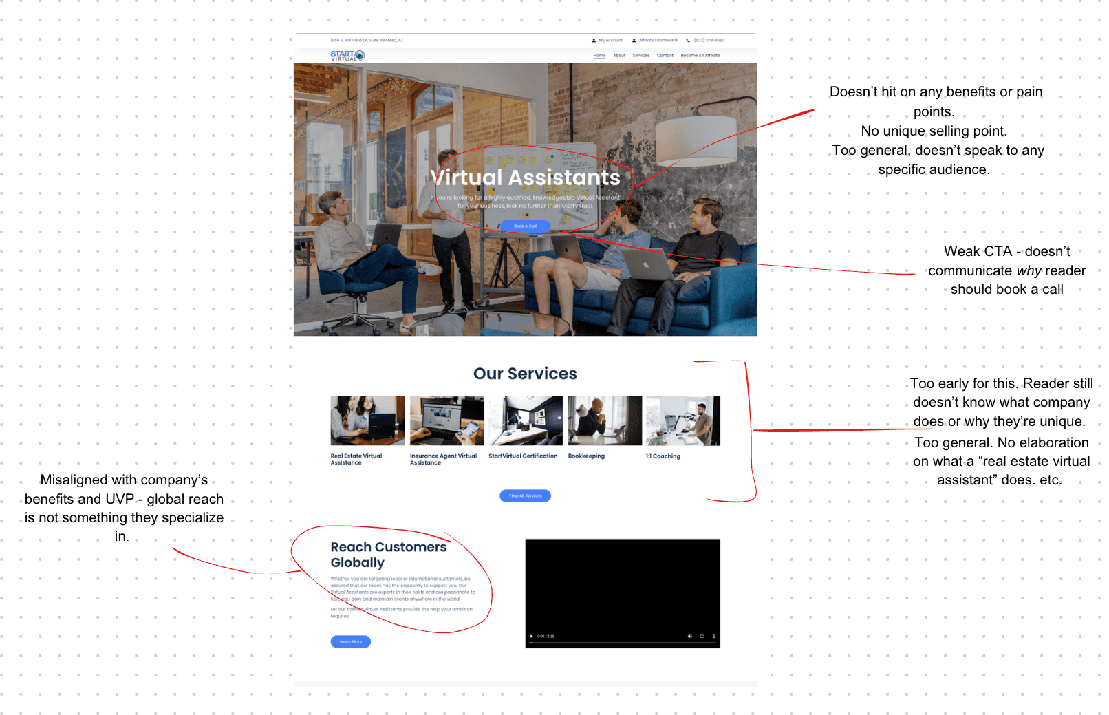
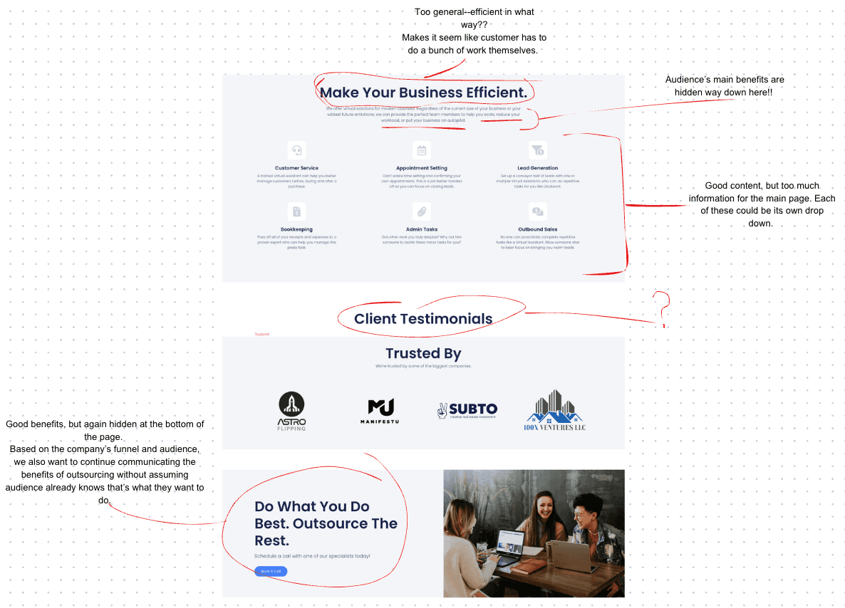
The StartVirtual home page wasn't converting. The messaging wasn't aligned with the company's UVP. The copy wasn't speaking to the audience.
Let's do something about that....
The process:
I interviewed key members of the StartVirtual team to better understand how their services outperform their competition.
With countless virtual assistant agencies out there, I went on a mission to figure out what makes StartVirtual unique. I spoke with the leadership team and some VAs to get to the core of the company.
I researched their audience, their direct competitors, and their indirect competitors to see what's working and identify gaps in the market.
Then, I did an audit...
02 — Creative process
Following an audit of the existing home page, I decided to reposition StartVirtual in two ways:
Almost like a SAAS company, where everything is done for you + with a more modern simplified feel.
With a human-centric approach, so the audience can see the assistants they're hiring, negating any hesitancies they have about working with overseas talent.

