ActiveYou
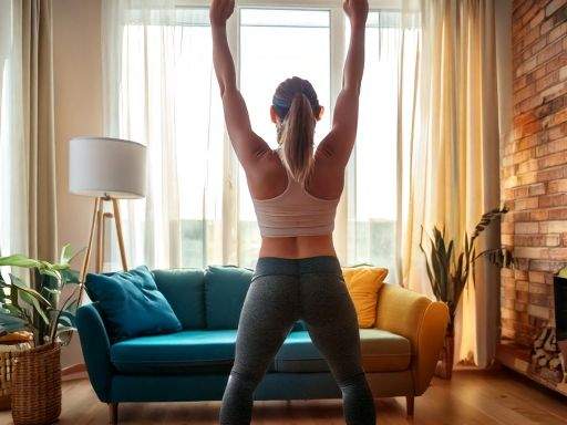
Overview
This campaign was created for the General Assembly: Adobe Creatives course. The brief was to choose a sample marketing campaign from a list of options and develop creative assets to bring the campaign to life.
These included:
A new logo and brand guide
Social media posts and videos
Display ads and banners
Print collateral
It was required to adhere to the guidelines I chose throughout the project, and use AI tools to streamline content creation and improve design efficiency by generating concepts to take inspiration from.
The first part to tackle was the logo design.
For this I accessed the templates available on Adobe Express to drive inspiration and brainstorm ideas.
I concluded with a simplistic design that provides the information of ActiveYou being part of the fitness industry with a community feel.
Let's break down the brand guidelines
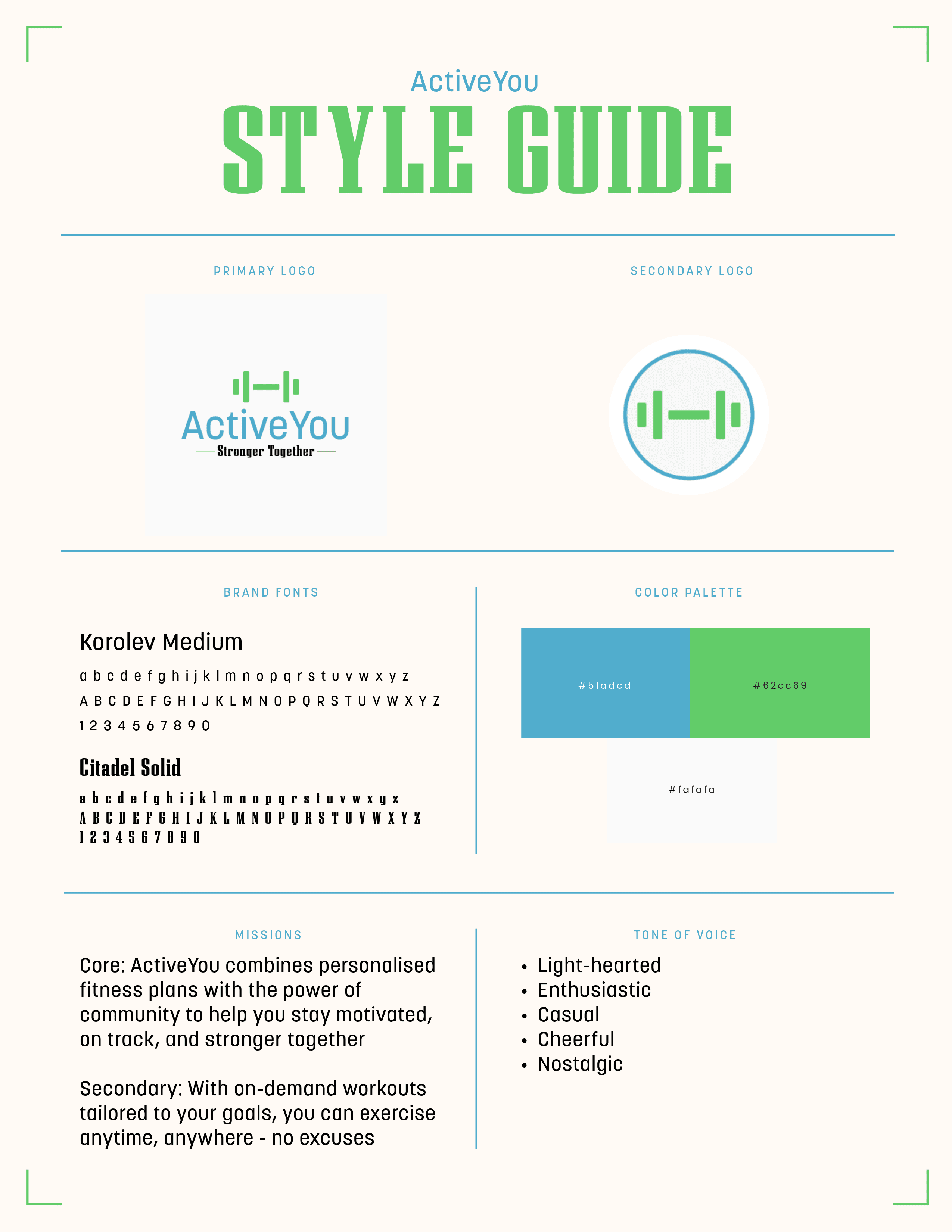
The colours were chosen based upon the feelings they typically evoke.
Blue = focused
Green = alive and free
White = relaxed
The core message of this brand is to maintain consistency with fitness through the flexibility the app provides. Therefore, being focused is the main feeling associated with motivation leading to the decision to make blue the primary colour for this campaign.
Typography was selected with the considerations of a clean yet strong aesthetic, creating the decision to compliment a serif font with a sans serif one.
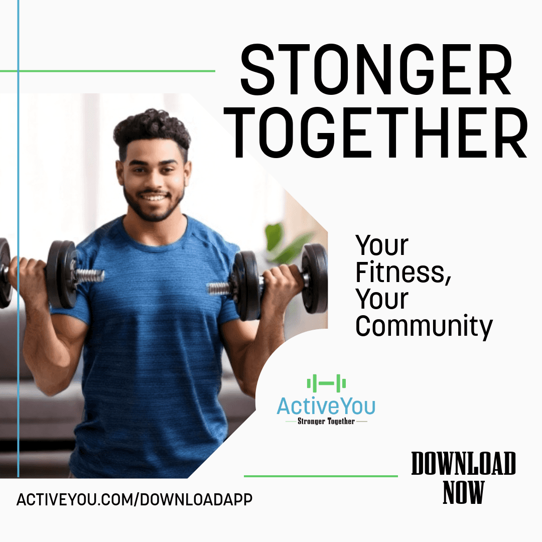
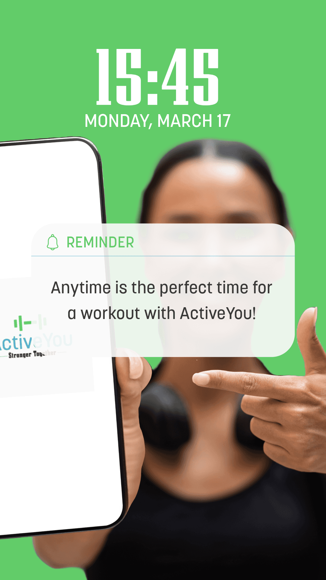
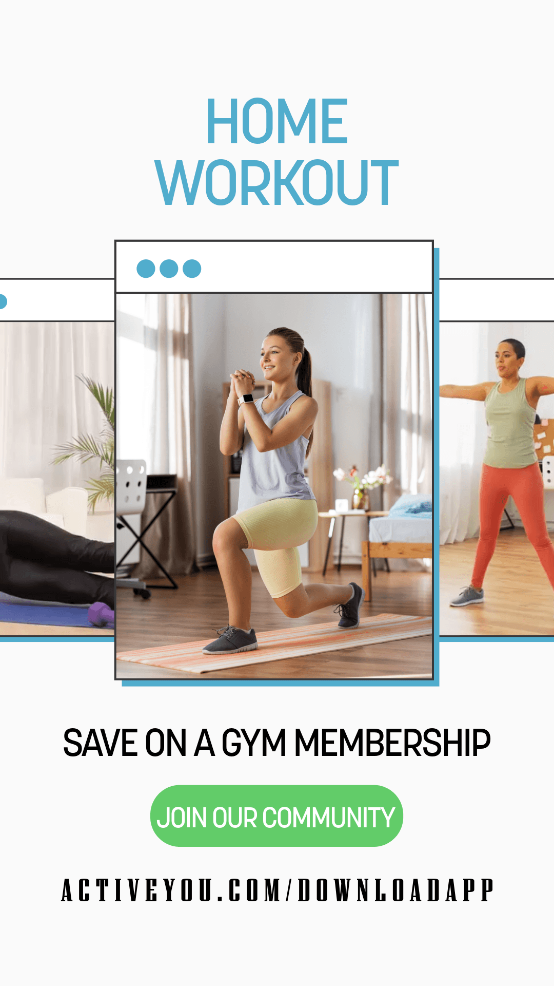
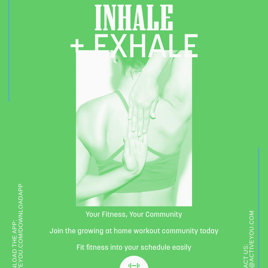
Social Media Post 1
The idea was to maintain consistency with an authentic feel to not take away from the message of 'stronger together'
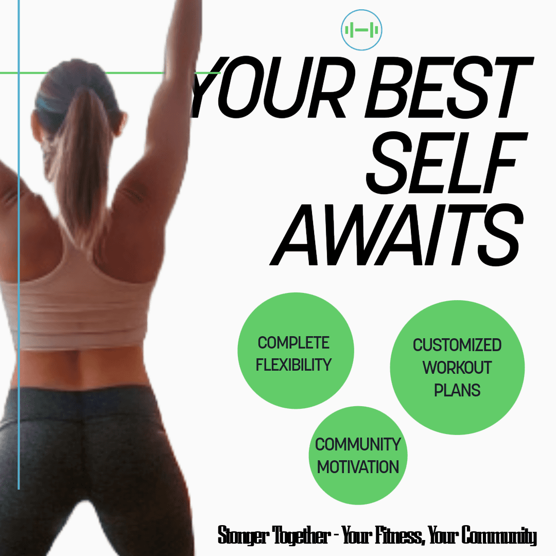
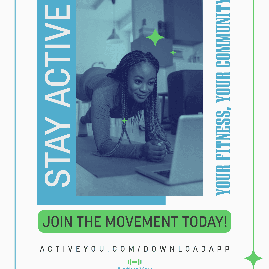
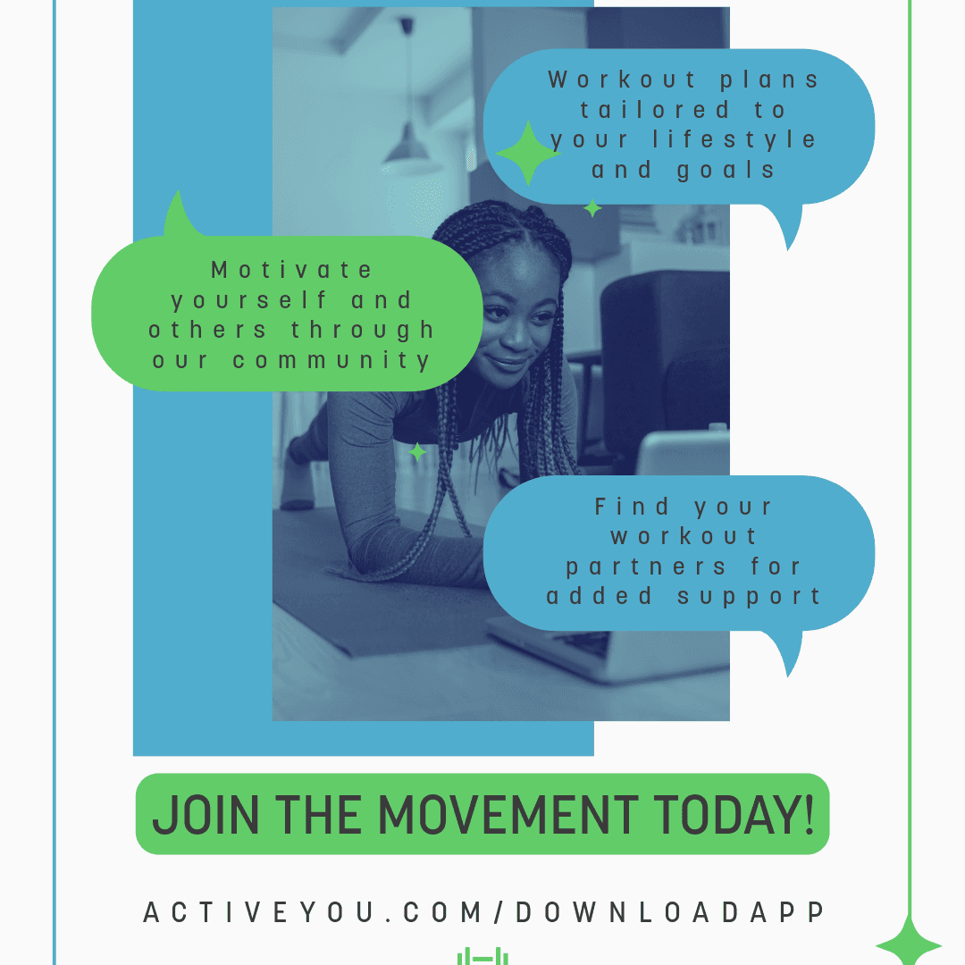
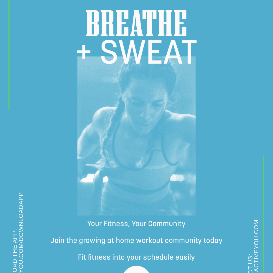
Social Media Post 2
The idea was to maintain consistency with an authentic feel to not take away from the message of 'stronger together'